One search bar for the whole app, in both the Editor and the Processor.
**Cmd/Ctrl+K** from anywhere.

- **Editor** — your files, tools, settings, and everything in the
Processor: its pages plus live users, policies, pipelines, sources, and
full-text developer docs.
- **Processor** — the same bar over its own data (users, policies,
pipelines, sources, docs) plus tools and settings. Files stay
editor-only; pages stay out (the sidebar covers them).
- **Filter chips** (and typed prefixes like `policy: invoice`) narrow to
one lane; each group shows a few results with **Show more** to expand.
- **Access-gated**: users only see lanes and settings sections they can
actually open — no Processor chips, results, or entity fetches without
portal access, no admin settings for non-admins, no account-bound
sections for anonymous SaaS sessions. Asserted by unit tests and a
stubbed Playwright suite.
- Selecting a result takes you straight there, across apps when needed —
results group under collapsible sections.

Replaces the separate search boxes that previously lived in the file
sidebar, the tool panel header, the settings modal, and the docs page.

### Editor

<img
src="https://gist.githubusercontent.com/reecebrowne/5879e797c5ab6abc027a7bfd5cd4de17/raw/editor-search.png?v=2"
width="800" alt="Editor super search" />

### Processor

<img
src="https://gist.githubusercontent.com/reecebrowne/5879e797c5ab6abc027a7bfd5cd4de17/raw/portal-search.png?v=2"
width="800" alt="Processor super search" />

---------

Co-authored-by: EthanHealy01 <ethan.healy.21@gmail.com>
## What

Empties the light Storybook accessibility baseline — **1,058
grandfathered violations across 846 stories → 0** — so a new violation
fails the gate instead of being silently absorbed. Also burns the dark
baseline **812 → 56**; every entry left is one `main` already
grandfathers.

## The defect, repeated everywhere

A colour picked as a **fill**, chosen to carry a white label at 3:1,
reused as **text**, where the floor is 4.5:1. It recurred through status
accents, filled buttons, form labels, Mantine's light and outline
variants, CSS declarations, inline styles and the generated accent ramp.

Three systemic causes account for most of it:

- **Mantine's semantic slots were never bound.** `-text`, `-outline`,
`-light-color`, `-filled` and `-dimmed` all default to the hue's solid
fill. Both resolvers now pin them to the accessible ink for the active
scheme.
- **The tint ladder was compressed.** `--color-<hue>-50/100/200` pointed
at saturated 400-level primitives, so every "tint" background rendered
as a fill.
- **Text was faded with `opacity`**, pushing already-muted copy below
the floor. Each site now recedes via ink or surface, which is what
conveyed the state anyway.

## Dark mode

The colour resolver's dark half was empty, so dark fell through to
Mantine's stock palette — and fixing the naming violations unmasked the
contrast sitting underneath them. Both schemes now share one slot map,
since most slots are written in tokens that already flip.

The dark-only fixes: `--c-text-subtle` (3.0:1, used in 478 places), the
error and section-label inks, and the accent ramp's text step — which
light reaches by mixing toward black and dark has to reach by mixing
toward white.

## Also

- New `--c-*-solid` tokens for fills that must carry a white label,
distinct from the `--c-<tone>` values used for surfaces, borders and
icons.
- A `data-user-content-preview` opt-out for nodes rendering a facsimile
of the user's own document — WCAG governs the interface, not content
authored through it.

## Verification

- `task frontend:check:all` — green.
- Changed-set gate, both schemes, after the final rebase: **366 stories,
0 regressions**.
- Full sweep at the prior base — light **1,447 stories / 0 violations**,
dark **1,448 / 0 regressions**. The dark re-record was confirmed
key-by-key to be a strict subset of `main`'s, so nothing new is
grandfathered.

Roughly 28% of what this clears is naming and structure (`button-name`,
`label`, `aria-*`) and has no visual signature; the rest is contrast.
# Description of Changes
Scan a QR code in the Sign tool, draw your signature on your phone, and
it appears on your desktop ready to place. Rides the mobile scanner's
existing transfer sessions — no new backend endpoints.
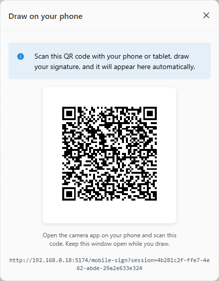
**Desktop:** a **Mobile upload** button above the signature source
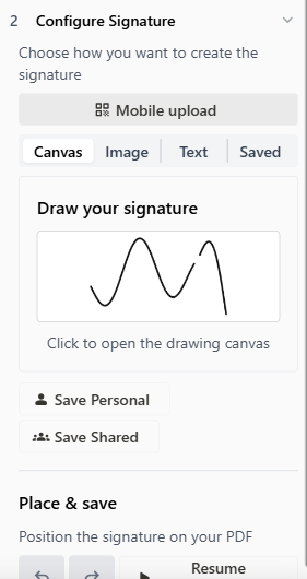
selector shows a QR code. When the signature arrives, the modal closes,
it lands in the matching source, and **placement activates
automatically** — click the PDF to place.
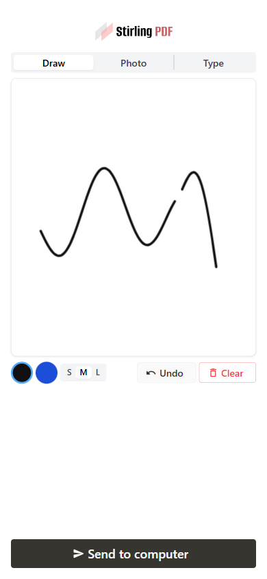
**Phone:** a new public `/mobile-sign` page with three tabs (same order
as the desktop sources):
- **Draw** → canvas signature. Touch-first pad (pointer events,
DPR-aware, smoothed strokes, undo/clear, black/blue ink, 3 pen sizes),
exported as a transparent PNG cropped to the ink. Compact layout in
phone landscape.
- **Photo** → image signature. "Take a photo" opens the camera directly;
"From gallery" opens the picker. A preview of the current image
signature now shows in the desktop's Image source (previously arrival
was invisible until placement — also fixes this for saved image
signatures).
- **Type** → text signature. Travels as data (text + font + colour), so
it stays *editable* on the desktop. Fonts are the sign tool's own
text-mode list.
**Security:** the transfer endpoints are unauthenticated by design
(10-min sessions, files deleted after download — same model as the
scanner). The desktop treats every arrival as untrusted: images only,
and the text payload is clamped field by field.
**Config:** new `system.enableMobileSignature` flag (default on),
independent of `enableMobileScanner`; the shared endpoints accept
either. The Tauri desktop app serves a self-contained `mobile-sign.html`
(draw-only), mirroring `mobile-upload.html`.
**Refactor:** the session lifecycle (create/poll/download/expiry) moved
out of `MobileUploadModal` into a shared `useMobileTransferSession`
hook; the scanner modal now uses it, behaviour unchanged.
Also fixes two bugs hit along the way: the signature pad collapsing to
its 150px intrinsic height (indefinite parent height), and a setState
loop in `SignSettings` when text parameters are set programmatically
(draft-sync effects ping-ponging).
## Screenshots
| Desktop: QR entry | Phone: draw | Desktop: received |
|---|---|---|
| 
| 
| 
|
## How to test
1. Open the app on an address your phone can reach (not `localhost`),
Sign tool → **Mobile upload**, scan the QR.
2. Draw → **Send to computer** → it becomes the active canvas signature
and placement is live: click the PDF to place.
3. Photo tab → arrives in the Image source with a preview. Type tab →
arrives editable in the Text source.
4. Flags: `enableMobileSignature: false` hides the button; signature
still works with the scanner disabled.
Verified end-to-end (all three kinds, portrait/landscape/tablet) plus
`task frontend:check` and the touched backend tests.
---
## Checklist
### General
- [x] I have read the [Contribution
Guidelines](https://github.com/Stirling-Tools/Stirling-PDF/blob/main/CONTRIBUTING.md)
- [x] I have read the [Stirling-PDF Developer
Guide](https://github.com/Stirling-Tools/Stirling-PDF/blob/main/DeveloperGuide.md)
(if applicable)
- [ ] I have read the [How to add new languages to
Stirling-PDF](https://github.com/Stirling-Tools/Stirling-PDF/blob/main/devGuide/HowToAddNewLanguage.md)
(if applicable)
- [x] I have performed a self-review of my own code
- [x] My changes generate no new warnings
### Documentation
- [ ] I have updated relevant docs on [Stirling-PDF's doc
repo](https://github.com/Stirling-Tools/Stirling-Tools.github.io/blob/main/docs/)
(if functionality has heavily changed)
- [x] I have read the section [Add New Translation
Tags](https://github.com/Stirling-Tools/Stirling-PDF/blob/main/devGuide/HowToAddNewLanguage.md#add-new-translation-tags)
(for new translation tags only)
### Translations (if applicable)
- [ ] I ran
[`scripts/counter_translation.py`](https://github.com/Stirling-Tools/Stirling-PDF/blob/main/docs/counter_translation.md)
### UI Changes (if applicable)
- [x] Screenshots or videos demonstrating the UI changes are attached
(e.g., as comments or direct attachments in the PR)
### Testing (if applicable)
- [x] I have run `task check` to verify linters, typechecks, and tests
pass
- [x] I have tested my changes locally. Refer to the [Testing
Guide](https://github.com/Stirling-Tools/Stirling-PDF/blob/main/DeveloperGuide.md#7-testing)
for more details.
## What

Makes Storybook render components with the same CSS the app gives them.

- The preview loaded the token primitives but **not the editor's
semantic token layer** (`styles/theme.css`), so components styled on
those variables rendered unthemed — three onboarding stories were
importing it by hand to stop their modal surfaces rendering transparent.
It's now loaded in the preview and the workarounds are gone.
- **Portal stories render inside the `.portal-scope` wrapper** PortalApp
mounts, so the portal's scoped reset and typography apply to them
exactly as in the app — and, deliberately, to nothing else.
- The folder stories invented their own hex colours, two of which aren't
values the app's `FOLDER_COLOR_PALETTE` can produce. They now use the
palette, so they can't drift from what a user can actually pick.

Deliberately does **not** load `tailwind.css` — tailwind is on its way
out of the editor, so matching the token layer alone is the target
state.

## Story colours route through the tokens, enforced

Stories were exempt from the `code-colors` lint, and it showed:
hardcoded hexes for surfaces the tokens already name (chat bubbles,
borders, demo backgrounds), `var(--x, #hex)` fallbacks that mask a
renamed token by silently painting the stale colour, and mocked category
accents for which real `--color-cat-*` tokens exist.

- Styling literals now use tokens; the dead fallbacks are stripped.
- The stories exemption is removed from `theme-lint`, so this can't
regress.
- Colours that are **the datum itself** — `ColorInput` values, signature
ink, per-policy accents, brand-mark swatches — stay literal via
`theme-allow-color`, hoisted to named consts so the exemption and its
reason sit together.

A practical side effect: stories styled on tokens actually respond to
the dark-mode toolbar toggle, which is what makes a dark-theme a11y pass
meaningful later.

## The a11y gate now runs dark as well as light

Contrast is most of what axe reports and it is theme-dependent, so a
light-only gate left half the surface unmeasured — and it only becomes
measurable at all once the tokens above actually flip. `SCAN_THEME=dark`
pins the theme for a whole scan run, every a11y task runs both themes,
and each theme has its own baseline:

- **light** re-recorded against the themed rendering (the old baseline
measured colours the app never shows): 831 stories with violations
- **dark** recorded for the first time: 798 stories with violations, 980
story-rule pairs, zero render failures across the full sweep

Verified end to end: dark scans measure against dark surfaces (`#18181b`
vs `#ffffff`), both baselines self-check clean, and a live scan of
stories that changed on main after recording passes both gates.
Nightly's timeout doubles for the second sweep.

## Testing

Typecheck (all variants), ESLint and Prettier pass. Onboarding, folder,
portal and control stories render in the browser scan (39/39) with the
per-story CSS imports removed; every story touched by the colour sweep
renders too (58/58). `task frontend:lint:colors` passes with stories
included.
## What

Two related bugs found while looking at why #7187's a11y check behaves
differently on CI than locally.

### 21 stories were never being scanned on CI

The scan tasks only depended on `install`, not `prepare`. On a fresh
checkout that means the generated icon set
(`editor/src/assets/material-symbols-icons.json`, gitignored) doesn't
exist, so every story that reaches `LocalIcon` fails to import:

```
Failed to resolve import "../../../assets/material-symbols-icons.json"
from "editor/src/core/components/shared/LocalIcon.tsx"
```

On CI that was four story files / 21 stories, every run. It works
locally only because our trees already have the file from a previous
build. The scan tasks now depend on `prepare`, like the `build:*` tasks
do.

### The gate reported those runs as clean

Worse than the missing stories: a file that fails to import produces a
**failed suite with no assertions**. Every check in `a11y-check.mjs`
reads assertions, so the file satisfied the manifest, contributed
nothing to compare, and the run printed `✓ no a11y regressions`.

An assertion-less failed suite now fails the gate and points at the scan
log for the underlying resolve error. `--record` refuses in the same
situation, so a baseline can't be written that quietly drops those
stories.

Also switched the affected-story emptiness test to single quotes, since
that list now carries its own per-path quoting (it was producing `[ -z
""a" "b"" ]`).

## Testing

- Deleted the generated asset to reproduce a fresh checkout: the gate
**fails** with the file named and the cause explained, where before it
printed `✓ no a11y regressions` and exited 0.
- With the `prepare` dependency the task regenerates the asset itself
and the previously-invisible files scan: 21 stories, 35 story-rule
pairs, all already baselined.
## What

Fixes the a11y check failing with `permission denied` on any PR that
touches more than one story (currently hitting #7163).

The script that lists which stories to scan printed one path per line.
That list gets pasted into a shell command, so everything after the
first line fell out of the command — the shell treated the second path
as a command of its own and failed.

One-line fix: print the list on a single line.

## Testing

Changed two components and ran the task from both git-bash and
PowerShell — both stories scanned, check passes. #7163's red check
should go green on re-run once this is in.
## What

Two fixes to the pull-request a11y job (#7086 follow-up), both found on
its first day live.

### It now scans a component's stories when the component changes

The job picked its scan set from changed **story files** alone. But a
story renders the live component — editing `Button.tsx` changes what
every Button story shows without touching a story file, and the job
scanned nothing. That's the common way a11y regressions arrive, and it
was exactly the case the job missed.

The scan set now also includes stories whose **same-named sibling source
file changed**: edit `Button.tsx` or `Button.css` and
`Button.stories.tsx` is scanned. Changes that ripple further than a
component's own stories (shared UI, theme tokens) remain the nightly
sweep's job.

### It no longer fails on cold-start infrastructure noise

The job's first real run (#7163) flagged a story as "failed to render".
The story was fine — on a cold dependency cache (**every** CI run), Vite
discovered the preview's own dependency graph mid-run and reloaded the
page, killing whichever story happened to be loading with `Failed to
fetch dynamically imported module`. Reproduced on a cold cache, passes
on a warm one.

- The preview's deps are named in `optimizeDeps.include`, which removes
the mid-run reload (verified cold).
- A batch whose report contains crash-class failures (failures carrying
no axe rule) is retried once — a one-off infrastructure death passes the
retry, a story that genuinely can't render fails both attempts and is
still reported.

Also: the scan-report artifacts were never actually uploading — they
live in a dot-directory, which `upload-artifact` silently skips as
hidden by default. `include-hidden-files: true` fixes that for the PR
job and the nightly, so a red run finally has its evidence attached.

### The glue is Node now, so tasks work from any shell

Raised in review: the pipeline leaned on `bash`, `sed`, `grep`, `sort`
and `tr`. Task runs its commands in an embedded POSIX interpreter, but
those are external binaries it has to find on PATH — and a Windows dev
calling tasks from **PowerShell** has none of them (`sed`/`tr` missing
outright, `sort` resolves to Windows' own, and `bash` resolves to
*WSL's*). Confirmed broken by running the task from PowerShell before
the change.

The batch runner and affected-story detection are now small Node scripts
(`a11y-scan.mjs`, `a11y-changed.mjs`) — the repo already requires Node,
so one implementation serves PowerShell, git-bash and CI alike, instead
of maintaining `.sh`/`.ps1` twins.

## Testing

- Sibling detection: editing `Tabs.tsx` (component only) pulls
`Tabs.stories.tsx` into the scan set; editing a `.css` sibling does the
same; nothing unrelated leaks in.
- **From PowerShell**: `task frontend:storybook:a11y:changed`
early-exits cleanly with no changes, and with a component edit it
detects the sibling, runs the browser scan and passes the gate — same
result from git-bash.
- Cold cache end-to-end: cleared both Vite caches, ran the scan — no
re-optimize, no reload, stories fail only on their (baselined) axe
results.
- Crash classifier: 1 on a synthetic crash report, 0 on axe-only
failures, 0 on a real report — so the retry can't be triggered by
legitimate violations.
- Full scan + gate run green end-to-end; taskfile parses, workflows are
valid YAML, Prettier/ESLint pass.

#7163's red check needs no action from that PR's author — it should go
green on re-run once this lands.
## What

Follow-up to #7073. Turns the story scan into an accessibility gate:
stories run axe in a real browser, and CI flags a change that adds a
**new** violation.

The app has plenty of existing a11y problems (mostly theme-level colour
contrast), so rather than block everything on those, they're recorded in
`.storybook/a11y-baseline.json` and grandfathered. The gate cares about
three things:

- a story breaking a rule it wasn't already breaking
- a story that fails to render at all
- a scan that didn't cover everything it was asked to

Starting point: 839 stories carry a known violation, 1058 story-rule
pairs.

## Where it runs

- **Pull requests** scan only the stories the branch touches — usually
seconds. A full sweep is ~30 minutes, too slow to sit in front of every
merge, and the `frontend` path filter is broad enough that unrelated
changes would pay for it.
- **Nightly** scans every story, so a violation introduced somewhere
other than the story itself — a shared component, a theme token — still
surfaces within a day.
- Both upload their scan reports as artifacts; the reports carry the
offending selector and help text, without which a red run can only be
understood by reproducing it locally.
- **Advisory to start with.** It is deliberately not in
`all-checks-passed`, so it reports without blocking. Worth promoting
once a few weeks of runs show the pass/fail is stable.

## Using it

- **Fixed some violations?** `task frontend:storybook:a11y:record`
re-records so the gate locks the improvement in.
- **Locally:** `task frontend:storybook:a11y:changed` for your branch,
`task frontend:storybook:a11y` for everything.
- **New component?** Its story is picked up automatically.

## Testing

- Every story — 526 files, ~1,450 stories — runs in a real browser with
no render failures, and the gate reports no regressions against the
baseline.
- Running the gate over a single changed story takes seconds, which is
the pull-request path.
- The gate's own behaviour is covered against synthetic scan reports: a
new rule fails, the same rule on more nodes does not, a crashed story
fails, an incomplete scan refuses to report, and re-recording refuses
while anything is crashing.
- Typecheck (all build variants), ESLint and Prettier pass.

## Notes for reviewers

Some of this PR is making the mechanism trustworthy rather than adding
features, so it's worth knowing what changed and why:

- Rule ids come from the axe docs URL in each violation, not a
hand-maintained list of rule names — the old list silently ignored 39 of
axe's 104 rules, including `object-alt`, `target-size` and the table
rules.
- The baseline records **which** rules a story breaks, not how many
nodes break them. Node counts drift between runs because stories fetch
asynchronously and axe samples whatever has rendered, which made
unrelated changes look like regressions. For the same reason the
baseline is the union of repeated scans, so a run can only be a subset
of it.
- A story that fails for a non-a11y reason used to yield no rule id and
was recorded as clean, which hid crashes and could mask real violations.
Those now fail, and re-recording refuses to run while any story is
crashing.
- The scan writes a manifest of every story file it intends to cover and
the check fails unless all of them reported, so a dropped batch can't
read as "no violations".
- Vite was pre-bundling the JSX runtime mid-run and reloading the page,
which crashed whichever stories were loading; those deps are now named
up front and the per-story timeout is above the 5s default.

Colour contrast dominates the baseline and is theme-level, tracked
separately from this.
## What

Gets most of the app's components into Storybook and adds a scan that
runs every story in a real browser, so we have a base to build
accessibility testing on next.

- **~380 new stories**, taking story files from 144 to 526. Components
with a story:

  | Layer | Before | After |
  |---|---|---|
  | core | 41 / 309 (13%) | **183 / 309 (59%)** |
  | portal | 91 / 161 (57%) | **127 / 161 (79%)** |
  | proprietary | 1 / 105 (1%) | **39 / 105 (37%)** |
| cloud / desktop / saas / portal-saas / prototypes | 0 / 84 | 0 / 84
(unchanged) |
  | **Total** | **133 / 659 (20%)** | **349 / 659 (53%)** |

Both columns are counted the same way — every `.tsx` exporting a
component, so the denominator includes things that aren't really visual
units (contexts, providers, barrels). Excluding those it's 22% → 58%.
Either way it's reproducible from the tree rather than a number you have
to take on trust.

- **Scan harness** — the Storybook Vitest addon runs each story in
headless Chromium as a **render/smoke check** (a story must mount
without throwing). New task: `task frontend:storybook:test` (pass a
filter, e.g. `-- Button`). Separate Vitest config so it doesn't touch
the existing jsdom unit tests.

## Scope

- **Stories and Storybook config only, with one exception:** a one-line
fix to `ProviderCard`, which re-rendered forever whenever its optional
`settings` prop was omitted. Called out because it's the only component
source change here.
- The preview gains a `QueryClientProvider` (the portal app has one, so
stories reaching a query hook threw without it), and the scan task now
installs the browser it drives.
- **a11y is report-only** and **nothing runs the scan in CI yet** —
enforcing a11y and wiring it into CI is the follow-up, #7086.
- Components that can't render as an isolated unit are **not** included:
anything needing the full editor runtime (ToolWorkflow / FileManager /
AppConfig / a live PDF engine) or that's headless (providers, gates, API
bridges, config factories). Stories that only rendered by mounting the
whole `AppProviders` tree were dropped for the same reason — that isn't
isolation, and the tree's ErrorBoundary swallowed render failures so
those stories could never fail. A few that need assets the headless
browser can't serve are tagged `!test`, so they still show in the UI but
sit out the scan.

## Testing

Typecheck (all build variants), ESLint, Prettier and the unit suite
pass. Every story in the scanned set mounts without throwing.

## Notes for reviewers

- Stories use the `@app`/`@core`/`@portal`/`@proprietary` aliases (no
deep relative imports) and mock data-fetching components with MSW.
- Running the full suite in one go can flake on the Vite dep-optimizer;
scan in small batches (or by filter) for a stable local run.
## What

Adds a globe toolbar to Storybook so any story can be previewed in all
42 supported languages (the i18n init already on `main` was
English-only).

## How

Bundles every locale's `translation.toml` via a `?raw` glob into i18next
resources, and switches language on toolbar change. RTL locales (`ar`,
`fa`) flip `document.dir`.

---------

Co-authored-by: James Brunton <jbrunton96@gmail.com>
Removes some cluttered/unused UI from the portal:

- Search bar in the header
- The top bar entirely (breadcrumb, notification bell, plan switcher,
user menu)
- The plan/usage indicator in the sidebar footer
- The floating assistant badge

UI only. Where a component isn't deleted it's just no longer rendered,
so anything here is easy to restore.
## What

Removes the policy **management** surface from the editor's right rail —
the Policies list above Tools, the open-policy detail takeover, and the
collapsed-rail policy icons — along with the whole UI tree only they
used: the setup wizard and its tool-config steps (PII / redact /
watermark), the detail panel, delete modal, selection store,
enforcement-queue status chip, activity/stats derivation, the catalog
hook, their i18n keys, dead types, and the admin-gate spec that tested
the wizard flow.

**Enforcement is untouched.** Auto-run on upload, the viewer blocking
overlay, exit-point blocking, file badges, and export-time enforcement
all stay. `usePoliciesEnabled` moves to its own module (core stub /
proprietary / desktop shadow with the SaaS-connection check) since it
still gates mounting the headless `PolicyAutoRunController` from the
rail.

## Why

Policies are configured in the admin portal now
(`src/portal/views/Policies.tsx`). Keeping a second management UI in the
editor rail meant two surfaces to maintain for one feature; the editor
only needs to *enforce*.

## Notes for review

- The rail UI lived in the shared `core` `RightSidebar`, so this removes
it from every build flavour at once; the deleted `PoliciesSidebar`
module existed at the core (stub) / proprietary / desktop alias layers
and all three are gone.
- Every deleted module was verified to have zero remaining importers;
near-misses that stay: `enforcementQueue` (used by export enforcement),
`poll` (test-imported), `usePolicies` (used by auto-run).
- Net −3,900 lines.

## Testing

- `task frontend:check` green: typecheck, ESLint + dpdm, Prettier, all
1,196 tests.
- All build-variant typechecks pass (core / proprietary / saas /
desktop).
## What this does

Reworks the portal's policy setup screens so a policy reads as **its own
settings**
rather than a list of tools you wire together, and rebuilds the forms on
the
shared design system so they match the rest of the portal.

## Why

Setup showed one card per underlying tool (tool name + a toggle), which
exposed
the "a policy is a pipeline of tools" plumbing. A policy should read in
terms of
what it does to a document, not which tools run under the hood.

## Changes

- **Setup reads as policy settings.** The per-tool cards are now a
plain-language
list of what the policy does — "Redact sensitive information", "Strip
active
content", "Apply a watermark", and so on — each with a short description
and a
  toggle, with its options appearing inline when turned on.
- **Consistent design system.** The setup and edit forms use the shared
  components instead of one-off styling.
- **Simpler setup.** Removed two sections that aren't part of what ships
here:
  Document Types (scope-by-type) and Retries.
- **Watermarks are text-only.** A policy watermark is a text stamp, so
the image
  option and the type picker are hidden.
- **The editor always shows as a source** (it used to disappear when no
other
  sources were connected), and the source tiles now lay out correctly.
- **Clearer upsell copy.** Locked policies read **"Upgrade to
Enterprise"**
  instead of "Coming soon".

## Scope

UI only — no backend changes. Keeping a policy's settings in sync
between the
portal and the editor is a known, separate issue and is **not** part of
this PR.

## Testing

Prettier, ESLint, typecheck (proprietary + saas), and the
unused-translation
guard all pass. Setup screens verified in Storybook.
The portal's `SettingsModal` was a parallel, mock-backed settings
implementation. It's replaced by the editor's `AppConfigModal`, mounted
via a new `PortalSettingsHost` that supplies the contexts the portal
doesn't have (app config, flavor-resolved session, preferences, editor
theme). Flavor resolution does the rest: the self-hosted portal gets the
admin sections, the SaaS portal gets the saas shell. The self-hosted
account-link panel rides in through the existing seam as an extra
section.

The shell gains three host props (`urlSync`, `initialSection`,
`extraSections`); editor behaviour is unchanged. Net −1,300 lines.

Manually verified on both flavors against live backends.
The portal no longer uses mock data — it always talks to the real
backend. Mocks still power Storybook and tests.

- Mocks button and all the in-app MSW machinery removed.
- Types the app needs moved out of mock files and into the api layer, so
the app no longer depends on `mocks/` at all.
- One deliberate exception for the onboarding tour (#6926):
`enablePortalDemoData()` fills the views with example data while a tour
runs, with zero cost the rest of the time.

Heads up: views without a real backend endpoint yet now show empty/error
states in dev.
## What

While a per-file policy run is in flight, the editor now blocks every
way the file can leave the app, and shows why:

- **Viewer** — a blocking overlay with live progress ("Enforcing
policy…"). Dismissible: collapses to a corner badge (top right, tinted
with the policy's accent) so the file stays readable while the run
finishes.
- **Workbench bar** — Print / Download / Save As / Share are disabled
with an explanatory tooltip and progress bar. The Ctrl+P shortcut and
the form-fill bar's "Download PDF" button are covered too.
- **File lists** — the file sidebar, file-editor thumbnails, and files
page show a spinning shield badge on the affected file, and thumbnail
hover actions (download / upload to server) are blocked with the same
tooltip.

Once a run settles, everything unblocks — including FAILED and CANCELLED
runs. A failed check surfaces through the run's activity feed; it never
locks the user out of their file.

## Why

Upload-triggered policies exist so the enforced output is what leaves
the app. Before this, a file could be printed, downloaded, or shared
while its policy run was still processing.

## Also in here

- **One shared `PolicyBadges` component** — the sidebar, thumbnails, and
files page each had their own copy of the badge markup/CSS and had
drifted (different sizes, tints, missing spinner and glow on the files
page, hardcoded English tooltips). All badge surfaces now render the
same component: accent-tinted shield, spinner while enforcing, one-off
glow when recent, i18n'd tooltips.
- **Cascade fix:** outputs imported from reconciled
(server-rediscovered) runs are now tagged `derivedFromTool`, stopping an
auto-run → import → auto-run loop that produced ever-growing
`_sanitized_sanitized…` filename chains on fresh devices.
- **Core stub for `policyRunStore`** so the core build compiles —
`WorkbenchBar` and `ViewerShareButton` resolve `usePolicyRuns` via
`@app/*`.

## Testing

- `task frontend:check` green: proprietary typecheck, ESLint + dpdm,
Prettier, 915+ editor + 81 portal unit tests.
- `typecheck:core` / `saas` / `desktop` variants all pass.
- Enforcement flow exercised manually against a live backend with an
upload-triggered policy (overlay + progress during the run, dismiss to
corner badge, unblock on completion).

---------

Co-authored-by: James Brunton <jbrunton96@gmail.com>
Adds the portal's top-left app switcher to the editor sidebar, so you
can jump between the two apps from either side.

- Both sidebars render the same shared `AppSwitch` component (sui
dropdown).
- Switching is client-side (no page reload); portal→editor no longer
breaks when `VITE_EDITOR_URL` is unset.
- Editor side is admin-gated (`portalAccess`) and only exists in flavors
that ship the portal — core/desktop stub it out, same seam pattern as
the portal routes.
- Fixes en route: dropdown menu stacking in the editor sidebar, sui
dropdown item button reset, stale `dist-portal` ESLint ignore.
## Summary

Converts SUI's existing Select and Slider to Mantine-backed
implementations, and adds three new Mantine-backed SUI components:
MultiSelect, NumberInput, ColorInput.

All five components follow the same contract as the rest of the SUI
catalogue:
- Imported from `@app/ui` — Mantine is an implementation detail
- Explicit prop allowlists: appearance props (color, variant, radius,
classNames, styles) are locked internally to SUI tokens; only
behavioural props are exposed
- Labels and error messages stripped from the interface — callers use
`<FormField>` for both. The components take an `invalid` flag that
applies error styling only; Mantine never renders its own message
element, so the text can't appear twice
- `aria-label` / `aria-invalid` / `aria-describedby` and `FormField`'s
injected `required` are forwarded, so the injected accessibility wiring
reaches the underlying input. Mantine drops some of this wiring
internally (`aria-describedby` on inputs, all aria props on Slider's
thumb, `required` on MultiSelect's field), so `ariaForwarding.ts`
re-applies it to the DOM node and `ariaForwarding.test.tsx` locks the
contract in
- Typed escape hatches (`comboboxProps`, `popoverProps`, `rightSection`)
documented for the z-index-in-modal use case

**Select** — rebuilt from native `<select>` to Mantine combobox. Gains
searchable/clearable. `onChange` now receives the value string directly,
not a DOM event — callers updated.

**Slider** — rebuilt from native `<input type="range">` to Mantine
Slider. Gains accessible keyboard navigation and `marks` support.

**MultiSelect, NumberInput, ColorInput** — new components. The behaviour
(multi-select combobox, number stepper, colour picker) is too complex to
hand-build correctly; Mantine provides it for free behind a locked SUI
interface.

Also wires `suiCssVariablesResolver` into the Storybook
`MantineProvider` so Mantine combobox/popover dropdowns follow the SUI
palette in dark mode, and adds `"neutral"` accent variant to
`IconBadge`.

## Usage

```tsx
import { Select, Slider, MultiSelect, NumberInput, ColorInput } from "@app/ui";
import { FormField } from "@app/ui/FormField";

// Select — onChange receives string | null, not a DOM event
<FormField label="Retention">
  <Select options={options} value={value} onChange={setValue} searchable clearable />
</FormField>

// Slider — same external API as before, now with marks support
<FormField label="Confidence">
  <Slider value={v} onChange={setV} min={0} max={1} marks={[{ value: 0.5, label: "0.5" }]} />
</FormField>

// New components
<FormField label="PII types">
  <MultiSelect data={options} value={value} onChange={setValue} searchable clearable />
</FormField>

<FormField label="Opacity">
  <NumberInput value={opacity} onChange={setOpacity} min={0} max={100} suffix="%" />
</FormField>

<FormField label="Watermark colour">
  <ColorInput value={color} onChange={setColor} />
</FormField>
```

## Notes

- **Select `onChange` is a breaking change** — receives `string | null`
instead of a DOM event. All existing callers in this repo are updated.
- The policy PR (`main` WIP) depends on this merging first.
- Stories for all five components are under **Primitives / Forms** in
Storybook.
## What

Makes `@shared` the single home for the Stirling brand logo assets.
Moves the editor's two logo sets — `classic-logo` + `modern-logo` (22
files: marks, wordmarks, favicons, login headers, PNGs) — out of
`editor/public/` into `shared/assets/brand/`, and adds a Storybook
**Brand/Logos** gallery.

## Why this shape (not a plain move)

The editor serves logos by **URL** from `public/` and switches
`classic`/`modern` by a **user preference** (`useLogoAssets`,
`manifest.json` / `manifest-classic.json`, `index.html` favicon links).
Rewiring all that to module imports would be a large, risky change to
the variant system.

Instead the editor keeps its variant system **unchanged** and just
sources the files from shared: `vite-plugin-static-copy` copies
`shared/assets/brand/{classic,modern}-logo/*` back to the served
`/{classic,modern}-logo` paths (the editor already uses this plugin for
pdfium/pdfjs assets). Single source of truth in shared, zero editor
code/manifest/markup changes.

## Verified

- **Build:** editor builds with both sets present at
`dist/{modern,classic}-logo/`; `manifest.json` + favicon refs resolve.
- **Dev:** the vite dev server serves the bridged paths —
`/modern-logo/logo512.png`,
`/modern-logo/StirlingPDFLogoNoTextDark.svg`,
`/classic-logo/favicon.ico` all return **HTTP 200** (the plugin's dev
middleware).
- Typecheck clean on core/proprietary/saas; prettier clean; `storybook
build` succeeds with the `Brand/Logos` gallery bundled.
- The portal's existing `@shared/assets` brand imports are untouched.

## Follow-ups (not in this PR)

- **Dedup:** `shared/assets/stirling-mark-*.svg` is byte-identical to
`brand/modern-logo/StirlingPDFLogoNoTextDark.svg`, and
`stirling-pdf-logo-*` is a near-twin of the modern wordmark. Reconciling
these (and re-pointing the portal) needs a designer eye on which
wordmark is canonical, so it's left out here to avoid changing the
portal's rendered logo.
- `editor/src/logo.svg` appears unused (no references) — candidate for
deletion separately.
> **Draft / WIP** — print enforcement is still to come (see below).

## Goal

A "run on export" policy must enforce on **every** path where a PDF
leaves the editor, not just the main Download/Export button. This routes
the remaining exits through the existing export-policy gateway
(`downloadFileWithPolicy`), which runs `enforceExportPolicies` before
the file leaves and is a no-op when no export policy is active.

## Audit of exit paths

| Path | Status |
|---|---|
| Web download / export, page-editor, file-editor, thumbnails | ✅
already covered (gateway) |
| **Form-fill download** (`FormSaveBar`) | ✅ fixed here — was a raw
`createObjectURL` download |
| **Desktop Ctrl+S save** (`useSaveShortcut`) | ✅ fixed here — was raw
`downloadService` |
| **Desktop save-operation-results** (`operationResultsSaveService`) | ✅
fixed here — was raw `downloadService` |
| Viewer `saveAsCopy` (annotations/redactions) | n/a — in-memory version
saves, not exits |
| **Print** (`printActions.print`) | ⏳ pending — enforce-then-print
(below) |
| Web operation-results (`downloadFromUrl`) | ⏳ pending — URL-stream,
needs a fetch→enforce wrapper |
| Share link | excluded by design (enforce at share-creation, not
recipient download) |

## In this PR

All three fixes are the same pattern — route the raw download through
`downloadFileWithPolicy` instead of `URL.createObjectURL` / the raw
download service.

## Still to come (why it's a draft)

- **Print** — enforce-then-print: on print, run the same
`enforceExportPolicies`; if it changed the doc, swap the viewer to the
enforced version (new version in history) and toast *"PDF updated by
policy enforcement — review, then print again"* rather than silently
printing a different doc; if unchanged, print. Covers Ctrl+P, the
toolbar button, and embedded PDF-JS print.
- **Web operation-results** (`downloadFromUrl`) — fetch the result to a
blob, enforce, then download.

## Verification

Typecheck (core/proprietary) + prettier clean for the changes here;
desktop tsc clean for the touched files. The print UX, once added, needs
a manual run with an active export policy — there's no automated path
for it.
## Overview

Internationalizes the **developer portal**, which previously had **zero
i18n** — every string was hardcoded across ~118 components. Rather than
stand up a parallel system, this shares the **editor's** existing i18n
setup (same TOML locale format, same Crowdin pipeline), then converts
every portal surface to `react-i18next` and adds a CI guard so coverage
can't regress.

## What's included

### 🔗 Shared i18n core (`@shared/i18n`)
- Extracts the editor's `TomlBackend` (HTTP loader for
`public/locales/{lng}/translation.toml`) and language metadata/helpers
(the 42-language list, RTL set, `LanguageSource` priority, code
normalizers) into `frontend/shared/i18n/`.
- The **editor** now imports and re-exports these from `@shared/i18n` —
its 20+ consumers are unchanged. Its local `tomlBackend.ts` is deleted.
- The **portal** builds its own i18next instance from the shared core,
with **en-US as the source of truth** and the same
`/locales/{lng}/translation.toml` layout.

### 🌍 Full portal coverage
- Every view and component converted to `t()` — all feature areas (home,
pipelines, sources, infrastructure, usage, documents, agent-builder,
editor-admin, policies, users, docs, catalogue, components view) plus
app shell, nav, modals, and the home/domain widgets.
- **1108 keys across ~30 namespaces** in
`portal/public/locales/en-US/translation.toml`, grouped by feature;
shared strings under `[common]`. Plurals use i18next count forms;
dynamic labels (nav, settings sections, status badges) use template keys
against populated tables.
- Data-driven strings (values from `@portal/api/*` mocks, enum/id
values, code samples) are intentionally left untranslated — they're
data, not UI chrome.

### ✅ CI coverage guard
- `portal/scripts/check-i18n.mjs` fails if any static `t("key")` in
portal source is missing from the en-US locale. Wired into
`frontend:check` and `frontend:check:all`, so missed keys break CI. This
mirrors the editor's `missingTranslations` test for the portal, which
has no vitest harness of its own.

## Testing
- `task frontend:check:all` passes locally (typecheck all variants,
lint, format, **portal i18n guard**, builds, tests, storybook).
- Every static `t()` key verified to resolve in the locale (1108 keys /
186 source files); all dynamic key prefixes map to populated tables.
- Runtime sweep of all 12 portal routes shows **no unresolved keys** on
screen; nav labels, plurals, and array-backed copy all render real text.

## Follow-ups (not in this PR)
- **Crowdin** — register `frontend/portal/public/locales/` as a source
so portal strings flow through the same translation pipeline as the
editor (an ops step on the Crowdin side; there's no Crowdin config in
the repo).
- Only `en-US` is populated; other languages will arrive via the
pipeline.
## What & why

Policies (automation-backed enforcement) execute and bill through the
cloud backend, so the feature should only be available in the hosted
**SaaS** product — not in self-hosted proprietary or core builds. Today
it's enabled in the proprietary build (and the API is exposed in any
proprietary backend), so this locks it to SaaS on both layers.

## Frontend (build-flavor gate)

`POLICIES_ENABLED` is the single gate `usePoliciesEnabled` uses (rail +
auto-run controller).

- `proprietary` flag → **`false`** (self-hosted web no longer shows
policies)
- new `src/saas/constants/featureFlags.ts` → re-exports proprietary
flags, overrides `POLICIES_ENABLED = true`
- new `src/desktop/constants/featureFlags.ts` → same `true` override —
**required**: desktop's `@app` alias has no saas layer, and desktop
already gates policies on `POLICIES_ENABLED && useConfirmedSaaSMode()`,
so without a `true` here that runtime gate could never be satisfied.
Behaviour unchanged: desktop shows policies only when connected to SaaS.
- `PoliciesSidebar.test` mocks the flag on (it tests the component, not
the build gate — same pattern the existing `usePolicyAutoRun.retry.test`
uses).

## Backend (`@Profile("saas")` gate)

The saas backend runs under the `saas` Spring profile (as
`EntitlementGuard`, the AI controllers, etc. already do). The policy
beans are now `@Profile("saas")`, so `/api/v1/policies/*` and the
auto-run triggers exist **only** in the saas backend:

`PolicyController`, `PolicyEngine`, `PolicyRunner`, `PolicyRunRegistry`,
`PolicyValidator`, `JpaPolicyStore`, `FolderInputSource`,
`FolderOutputSink`, `InlineOutputSink`, `PolicyAccessGuard`,
`FolderAccessGuard`, `FolderWatchTrigger`, `ScheduleTrigger`,
`PolicyTriggerManager`.

**Deliberately *not* gated:** `PolicyExecutor` — `AiWorkflowService`
(always-on) injects it to run ad-hoc pipelines, so it stays
profile-free. It only depends on shared infra (`InternalApiClient`,
`ToolMetadataService`, `TempFileManager`, `ObjectMapper`), so leaving it
on is safe. Gating the engine/store/triggers as a set keeps wiring
consistent (nothing un-gated depends on a gated bean).

The saas `PolicyManagementAuthority` impl
(`TeamLeaderPolicyManagementAuthority`, `@Profile("saas")`) satisfies
`PolicyAccessGuard` in the saas context.
`AdminPolicyManagementAuthority` (`@Profile("!saas")`) becomes an unused
orphan in non-saas builds — harmless; left as-is rather than expanding
this PR's scope.

## Testing
- Frontend: full suite **869 pass**; typecheck clean on
proprietary/saas/core.
- Backend: `:proprietary` compiles, spotless clean, policy tests pass,
and the proprietary (non-saas) Spring context still boots with the
policy beans gated out (verified via the MCP `@SpringBootTest`
integration tests — no missing-bean failures).

Net: SaaS web build + desktop-in-SaaS-mode get policies (UI + API);
self-hosted proprietary and core get neither the UI nor the
`/api/v1/policies` endpoints.
## What & why

Production reports of policy enforcement "hanging" traced to
large/many-page documents: the watermark step's flatten-to-image
(`convertPDFToImage`) on a 500+ page PDF takes minutes, exceeding both
the client poll cap and the backend per-step timeout. This makes the
slow case graceful instead of looking broken, and makes load-shedding
non-fatal.

### Poll runs to completion (no false "hang")
The client poll loop used a flat ~150s cap that was **shorter than the
backend's 300s per-step timeout**, so it abandoned long-but-healthy runs
mid-flight. The budget is now sized to the backend's real worst case —
`stepCount × per-step timeout + grace`, learned from the first status
report — so the client always polls long enough to surface the run's
**actual** terminal state (success or the backend's real error) rather
than a misleading client-side timeout.

### Per-step progress
The activity feed now shows `Enforcing… · step n/m` (from
`currentStep`/`stepCount`), so a slow step shows movement instead of a
dead spinner.

### Soft-retry on queue rejection
Under load the shared `JobQueue` rejects runs ("queue full"), which
previously surfaced as a hard failure needing a manual Retry. The
backend now tags that rejection with a stable `POLICY_QUEUE_FULL`
errorCode; the client treats it as transient backpressure and
**auto-retries the file in place** with exponential backoff (≈4s→64s, ~2
min), shown as a soft "Busy — retrying…" row, falling back to the manual
Retry only once the retry budget is spent.

## Testing
- **Frontend unit tests** (30 pass across the policies suite), including
a new `usePolicyAutoRun.retry.test.tsx` that drives the real controller
orchestration (poll → `POLICY_QUEUE_FULL` → relabel → backoff → in-place
re-dispatch), plus poll-budget, step-progress, and activity-feed relabel
cases.
- **Backend** `PolicyEngineTest` case asserting a queue-rejected run
carries the `POLICY_QUEUE_FULL` code.
- Typecheck clean on all three flavors (proprietary/saas/core); prettier
+ spotless clean.
- Poll-budget + progress + real-error surfacing were also verified live
end-to-end against a 599-page run (survived past the old cap, showed
step progress, reported the backend's real 300s-timeout failure,
recovered after a simulated network drop).

## Not included (follow-ups)
- The underlying flatten-to-image cost itself (bounded-memory/streaming
flatten, revisiting `convertPDFToImage` default and the 300s timeout) —
the real perf fix, deliberately out of scope here.
`PolicyController` was annotated `@PremiumEndpoint` (requires a
Pro-or-higher server license). Policies don't need a server-license
gate:

- On SaaS the server runs in Pro mode, so the check is always satisfied
anyway — it gates nothing in practice.
- Access is already governed by team scoping (#6632) plus the per-user /
guest gates.

So the annotation is dead weight and misleading. This removes it (and
its import) — a 2-line change.

## Verification
- `:proprietary:compileJava` succeeds; spotless clean. No other premium
gate on policy classes.
Guests (anonymous users on a login-enabled deployment) could open a
policy's setup/detail. Policies are an account feature, so a guest
clicking a policy should be nudged to sign up rather than opening it.

## Behaviour
A guest clicking a policy row — or a collapsed-rail icon — now
**re-summons the existing guest sign-up banner** ("You're using Stirling
PDF as a guest!…") and does **not** open the policy.

- `GuestUserBanner` listens for a `stirling:show-guest-banner` window
event and re-shows (even if previously dismissed; the render guard still
hides it for non-anonymous users).
- The policy sidebar dispatches that event on a guest click (cross-layer
via `CustomEvent`, same pattern as `payg:signupRequired`; a no-op on
builds without the banner).
- `usePolicyGuestBlocked()` gates it: `config.enableLogin === true &&
user.is_anonymous === true`.
- **Login-disabled single-user** deployments have an anonymous local
operator with full access → not gated.

## Verification
- Typecheck clean (proprietary + saas); eslint clean; sidebar tests
pass.

## Note
No dedicated guest unit test — the suite mocks `useAppConfig` at module
scope, and making it per-test controllable needs `vi.hoisted` plumbing
that risked the existing tests. Easy follow-up.
Frontend follow-up to #6632 (team-scoped policies, editing gated to team
leaders on the backend). Brings the UI's edit gate in line.

## Problem
The policy config UI gated editing to `config.isAdmin`. On SaaS, org
users are never the single global admin, so **no one could open the
policy editor** — the same lockout #6632 fixed on the backend.

## Fix
`usePolicies` now allows a **team leader** to configure, falling back to
a global admin self-hosted:

```ts
canConfigure =
  config != null && (!config.enableLogin || isTeamLeader || config.isAdmin === true);
```

- SaaS → `isTeamLeader` (from `useSaaSTeam()`) — team leaders can
configure; members get the read-only surface.
- Self-hosted → `config.isAdmin` (the core `useSaaSTeam` stub returns
`false`, so admins aren't locked out).
- Login disabled (single-user) → always allowed.
- The `config != null` guard keeps the gate closed until app-config
resolves, so edit controls never flash for users who can't use them.

The two locked-policy banners now read "Contact a team leader to change
this policy" (updated in the `t()` defaults and the `en-GB`
translations).

## Verification
- Typecheck clean (proprietary + saas); eslint clean.
- Tests pass: `usePolicies`, `PoliciesSidebar`.
Follow-up to #6604 (merged). Builds the Security policy out so it
actually enforces, driven from the editor.

## What it does
- **Run on upload or export** — a single choice in the wizard: enforce
when a file is uploaded, or just before it's exported.
- **Output** — enforced result is a **new version** of the file
(default) or a **new file**, with optional filename
prefix/suffix/auto-number ("Output filename" subsection; auto-number
only for new files).
- **Export enforcement** — exporting an export-mode file runs the policy
first and downloads the enforced result; never hard-blocks (on failure
the original downloads). For new-version policies the in-editor file is
versioned too. Covers every export path incl. multi-file ZIP. A toast
(glowing in the policy's accent while it runs) reports progress and
fades after ~10s.
- **Affordances** — a freshly enforced file briefly glows its policy
accent and carries a shield badge.
- **Config tidy-up** — removed the unwired Security setting fields + the
wizard's review step; "Upgrade to enterprise" on locked categories;
category accent in the detail/wizard headers.

## Notes
- Builds on the manual-only (client-driven) policy model from #6587
(`trigger: null`, metadata in `output.options`), adding the `runOn`
field + export-time enforcement.
- The page-editor merge-export (no single source file) enforces +
downloads but doesn't version in place.

## Verification
typecheck (core + proprietary), eslint, prettier; proprietary suite
(105) green; flows checked in-app.
Follow-up to #6598 (squash-merged into `SaaS`). These are the policy
refinements made after that merge, against the current `SaaS` tip.

## Changes
- **Simplify Security config + plain-language info buttons** — Redact
config reduced to the PII field; Sanitise has no config
(JavaScript-removal only) with a non-technical info button; per-tool
info buttons reworded to match the tool-steps style.
- **Hide 'Flatten PDF pages to images' from the watermark policy
config** — new `PolicyWatermarkConfig` wrapping the watermark settings
with the flatten checkbox gated off.
- **Flatten-to-image on by default for redact + watermark** — both
normalise `convertPDFToImage: true` on mount.
- **Self-heal a stale backing folder** — `ensurePolicyFolder` recreates
a backing folder whose `folderId` no longer resolves (preferring the
backend's stored automation), instead of hanging Edit Settings on a
permanent "Loading…".
- **Version the input file on 'new version' output mode** — completed
runs whose policy output mode is `new_version` replace the input file
with a versioned child (origin tool `automate`) rather than adding a
separate file; falls back to a new file if the input is gone.
`outputMode` is plumbed through `PolicyState`, the local-cache default,
and backend reconciliation.

## Verification
- `typecheck:proprietary` + `typecheck:core` clean
- policy + hooks vitest: 17 passing
- eslint + prettier clean on all changed files
## Summary
Adds the **Policies** feature (proprietary, behind the
`POLICIES_ENABLED` flag): backend-driven enforcement that runs a fixed
tool pipeline on documents, docked in the right tool sidebar alongside
Tools.

## Highlights
- **Policy catalog** — 5 categories; **Security** is wired (redact PII +
sanitize), the others are marked "Coming soon".
- **Backend as source of truth** — policies persist via the Policies
engine (`/api/v1/policies`), one policy per category, with a local cache
+ offline fallback.
- **Auto-run** — enabled policies run on every uploaded file: dispatch →
poll → import outputs into the workspace.
- **Security redact config** — PII preset dropdown + custom word/regex
entry + advanced options; tool params map to the backend endpoint
fields.
- **Activity feed** with retry on failures; **file badges** showing
which policies ran on a file (sidebar + files page), tinted to the
policy colour.
- Reuses the **Watched Folders** engine for each policy's backing
folder; policy-owned folders are filtered out of the Watched Folders UI.

## Notes
- Gated by `POLICIES_ENABLED` (true in proprietary, false in core) —
unreachable in the open-source build.
- Frontend-only diff; depends on the backend Policies engine and the
merged Watched Folders feature.
# Description of Changes

## What & why

This PR introduces the **Stirling developer portal** — a new
control-plane frontend that sits alongside the existing PDF editor —
plus the shared design system and workspace structure needed to host
both apps in one frontend.

The portal is the parent product surface: where users connect sources,
compose pipelines, wire agents, and manage usage / billing /
infrastructure, with the PDF editor as one capability inside it. This PR
lays the **foundation** — workspace reshape, design system, app shell,
navigation, and a mock-driven home — rather than wiring real backends
(those surfaces are placeholders for follow-up phases).

## What's in this PR

**1. Frontend repo reshape (`frontend/src/` → `frontend/editor/`)**
The existing editor app moved under `frontend/editor/`, so `editor`,
`portal`, and `shared` are siblings in one workspace. All references
were updated accordingly: `LICENSE`, `.dockerignore`, `.gitignore`,
build/sign shell scripts, the GH language-check script, the Taskfile,
and Docker config. **No editor source logic changed — path references
only.**

**2. New shared design system (`frontend/shared/`)**
- **Design tokens** in `tokens.css` as the single runtime source of
truth (light/dark, category accents, gradients). `tokens.ts` now holds
only the `Tier` type — the old JS palette mirror was removed (nothing
consumed it and it had drifted).
- ~30 framework-light **components** (Card, Button, Input, Select, Tabs,
Modal, Drawer, Toast, MetricCard, StatusBadge, Skeleton, EmptyState, …)
with Storybook stories.
- **Typed data catalogues**: `endpoints.ts` (10 verticals / 64
endpoints) and `ops.ts`.

**3. New developer portal app (`frontend/portal/`)**
- App shell: `Header`, `Sidebar`, `AssistantPanel`, search modal,
notifications, tier switcher, theme toggle, MSW toggle.
- **Tier-aware** home (free / pay-as-you-go / enterprise): KPI strip,
30-day usage chart, onboarding checklist, quick actions, recent
activity, region health, product grid, and a curated **"Popular use
cases"** teaser.
- **Documents** view hosting the full, tab-filterable endpoint
catalogue.
- Placeholder views for Sources / Pipelines / Agents / Editor /
Infrastructure / Usage & Billing / Developer Docs / Settings (follow-up
phases).
- **MSW-mocked** API layer: `api/*` issues real `fetch`, intercepted by
mocks in dev/Storybook; pointing at a real backend is just a matter of
not registering MSW. `react-router` URLs; Tier / View / UI contexts.

**4. Tooling & guardrails**
- ESLint extended to `portal` + `shared`, with **layering-boundary
rules**: `shared/` may depend only on third-party packages and itself
(no `@app` / `@portal` / `@core` / `@proprietary` / Tauri), so it stays
cleanly extractable into a standalone package later.
- `dpdm` circular-dependency check now walks editor + portal + shared
(the old glob matched only 2 files).
- New **devDependencies only** — Storybook (+ a11y/docs/themes addons),
MSW. No runtime dependencies added.
- New tasks: `frontend:dev:portal`, `frontend:build:portal`.

## Testing done locally

- `tsc` for both `portal` and `shared` projects — clean
- `eslint --max-warnings=0` across the whole frontend — clean
- `dpdm` circular-dependency check — no cycles
- Editor builds clean: `vite build editor --mode core` (✓ built, only
the pre-existing >500 kB chunk-size advisory)
- Editor runs in dev (core mode) with **zero console errors**; portal
runs in dev across all three tiers

## Notes for reviewers

- The change is overwhelmingly **additive**: `shared/` and `portal/` are
brand-new; the existing editor is path-reference changes only.
- The portal is intentionally **mock-driven** at this stage — real
backends and the remaining views land in follow-up phases.

---

## Checklist

### General

- [ ] I have read the [Contribution
Guidelines](https://github.com/Stirling-Tools/Stirling-PDF/blob/main/CONTRIBUTING.md)
- [ ] I have read the [Stirling-PDF Developer
Guide](https://github.com/Stirling-Tools/Stirling-PDF/blob/main/DeveloperGuide.md)
(if applicable)
- [ ] I have read the [How to add new languages to
Stirling-PDF](https://github.com/Stirling-Tools/Stirling-PDF/blob/main/devGuide/HowToAddNewLanguage.md)
(if applicable)
- [x] I have performed a self-review of my own code
- [x] My changes generate no new warnings

### Documentation

- [ ] I have updated relevant docs on [Stirling-PDF's doc
repo](https://github.com/Stirling-Tools/Stirling-Tools.github.io/blob/main/docs/)
(if functionality has heavily changed)
- [ ] I have read the section [Add New Translation
Tags](https://github.com/Stirling-Tools/Stirling-PDF/blob/main/devGuide/HowToAddNewLanguage.md#add-new-translation-tags)
(for new translation tags only)

### Translations (if applicable)

- [ ] I ran
[`scripts/counter_translation.py`](https://github.com/Stirling-Tools/Stirling-PDF/blob/main/docs/counter_translation.md)

### UI Changes (if applicable)

- [ ] Screenshots or videos demonstrating the UI changes are attached
(e.g., as comments or direct attachments in the PR)

### Testing (if applicable)

- [ ] I have run `task check` to verify linters, typechecks, and tests
pass
- [x] I have tested my changes locally. Refer to the [Testing
Guide](https://github.com/Stirling-Tools/Stirling-PDF/blob/main/DeveloperGuide.md#7-testing)
for more details.

---------

Co-authored-by: Claude Opus 4.8 (1M context) <noreply@anthropic.com>
Show uneditable annotations on viewer
show editable annotations layer when in annotation tools (sign, add
image, add text)
Remove draw tool from viewer (this is replaced wholesale in an upcoming
PR so it wasn't worth doing the work to ensure it worked with the new
annotation layer set up_)
refactoring work, mostly renaming variables we can use for all
annotation based tools that had sign specific names.
remove "tools" tooltip

---------

Co-authored-by: Claude Sonnet 4.5 <noreply@anthropic.com>
Show signature preview on hover
Place signature smaller (mkatch preview size)
Retain signature in modal on close/open
Clean up ui generally
Small bug fixes
 Reece Browne




